


When I started my job at Three29 as a designer, one of my first tasks was to rebrand the company and give it a fresh coat of paint. The CEO thought it would be interesting if the new girl rebranded the company, because I was looking at it with a fresh set of eyes. I felt tremendous pressure because the brand would not only represent the company's ideals, but also its employees. I began by interviewing my coworkers and boss to get their take on what Three29, as a company, is supposed to be.
I presented a stylish and modern logo to the company. It was a significant departure from the old logo that was designed with Futura. This new logo had curves and attitude, but appeared just as welcoming. At the time, the company was fully named "Three29 Media." It referred to March 29th, which was the day that Three29 was born. I told my boss that the date would have no special meaning to anyone but the company. Therefore, the logo mark should just be a simple "T29" without the word Media. "T29" or "Three29" were shorter, easier to remember, and had a good ring to them.
My coworkers were all very excited about the new logo, but my boss had a hard time accepting it at first. He didn't think it represented what the company was. I told him that the logo represented what the company could be. Three29 was growing bigger everyday, and it was one of the fastest growing tech firms in Sacramento. He slept on the design and came back to the office the next day, fully embracing the new logo.
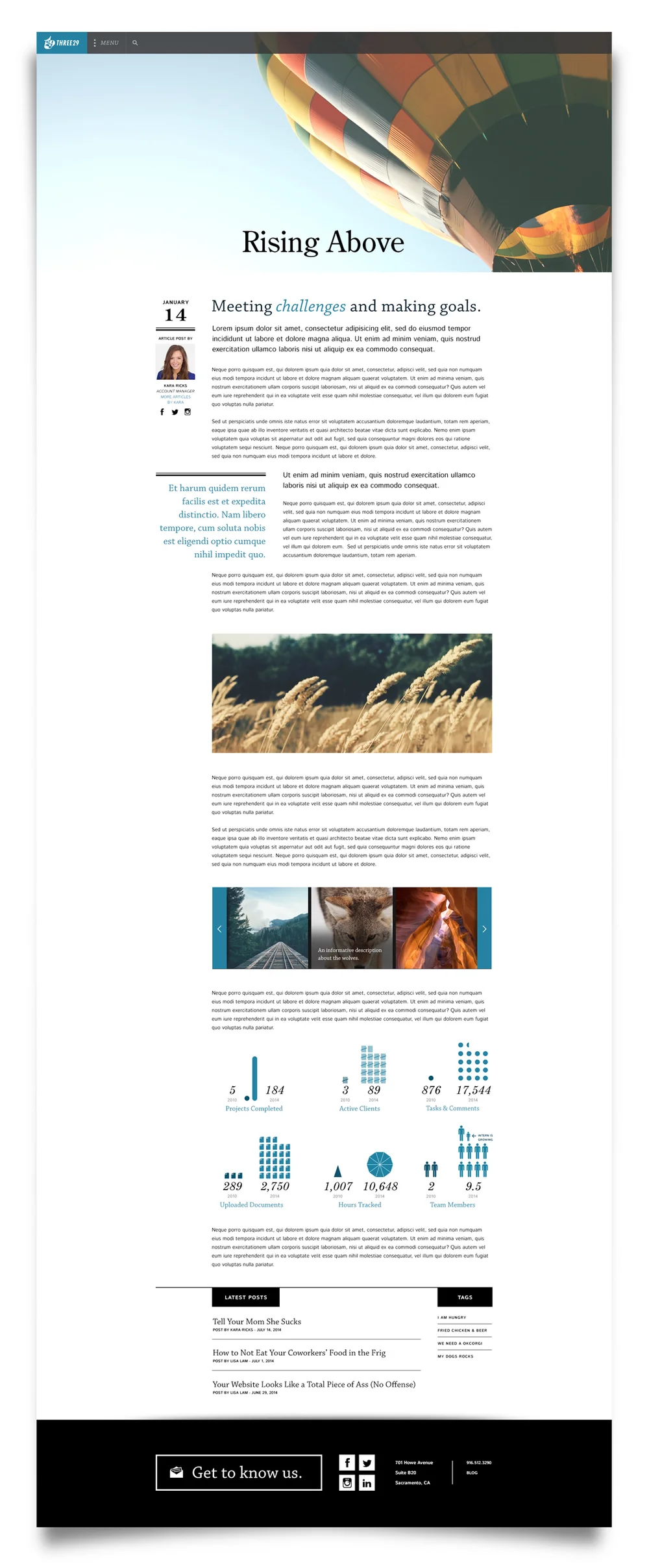
Three29's brand was placed in my hands throughout my entire employment at the company. Branding was an ongoing process and included any print media, T-shirt designs, and web design. In mid-2014, I was asked to redesign the company's website. This would be a huge undertaking, as it involves not only cataloging all of the company's works, but also presenting to the world a new makeover.
I worked with the team at Three29 to design the new website. The design was centered around search engine optimization, mobile responsiveness, modern design, and a dab of style. The type faces and layout were chosen for their readability. I wanted it to look like an editorial that made people want to read, from Vogue or Time magazine.
The design of the new Three29 website was clean, spacious, had lots to read, but was still EASY to browse through. Rebranding the company was one of the hardest yet most rewarding projects I worked on at Three29.